Early Limits of Web Images
People building personal pages in the first years of the web had few choices for pictures. The img tag let them place an image, but browsers handled only a handful of file types. GIF files worked for simple animations and small icons, while JPEGs handled photos with more colors. File sizes mattered because many users still connected through phone lines, so large pictures took minutes to appear.
Page layouts stayed basic too. Tables sometimes held images in place, yet positioning remained awkward without style sheets. Creators learned to keep graphics small and repeat them where possible. Background tiles, often in repeating patterns, added color without much weight.
File choice affected how fast a page felt. A single oversized JPEG could stall the rest of the load. Many early designers kept total image weight under a certain size so visitors would stay. This habit carried over even after connections improved.
Themed Comment Sets and Seasonal Graphics
Forums and guestbooks soon let users add short messages with pictures. These small images, sometimes called comment graphics, came in matching sets. A person might pick a row of gothic borders or fantasy icons to place under their text. The sets gave a quick way to mark a page without coding new elements each time.
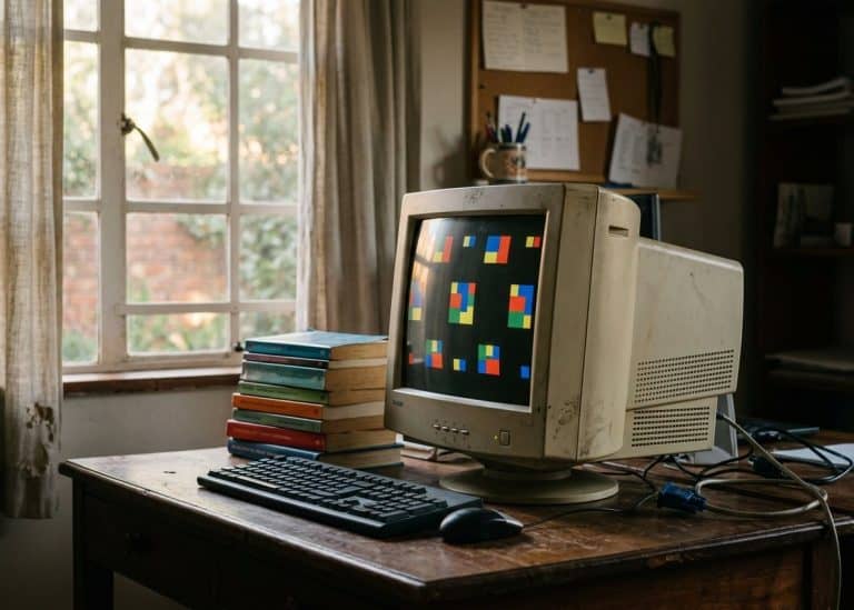
Seasonal changes followed the same pattern. Around holidays, users swapped in new borders or icons that fit the occasion. One month might show leaves or pumpkins, another snowflakes or candles. These swaps happened often because the files stayed small and easy to replace.
The practice spread through shared collections. Someone would make a set and pass it along to others on the same board. Over time the collections grew to include dozens of coordinated pieces, from dividers to bullet points. The focus stayed on decoration rather than large photos.
Shift to Profile Pages on Networks
When social sites appeared, the focus moved from full page design to a single main image. Users uploaded one picture that appeared next to their name and posts. The image had to fit within fixed dimensions set by the platform, which limited creative choices at first.
Later updates allowed a second, wider image across the top. This banner or cover area gave more room for scenery or artwork. People still chose small avatars for the main spot, often cropping a face or symbol from a larger file.
Custom code that once let anyone change fonts or add moving elements became restricted. Platforms replaced it with simple upload buttons and preset layouts. The change made pages load faster on mobile devices but reduced the range of personal touches available.
Embedded Media and Platform Changes
Newer sites began to pull in pictures and short clips from outside sources. Instead of hosting every file, a profile could reference media stored elsewhere. This kept the page light while still showing detailed artwork or short loops.
Embedded items brought their own rules. Some networks blocked certain file types for safety, while others required the media to come from approved hosts. Users learned to pick formats that worked across phones and computers without extra software.
The same period saw a rise in animated profile elements that played on their own. These short loops replaced older GIFs in many cases because they handled more colors and smoother motion. Still, many people kept static images to avoid distraction during long scrolls.
Current Practices for Clear Profile Images
Accessibility now guides many choices about profile pictures. Adding a short description helps screen readers explain the image to people who cannot see it. The text should name the main subject rather than just list colors or styles.
Contrast also matters. A dark figure on a dark background becomes hard to notice, so many users pick a light border or crop to a brighter area. Testing the image in different lighting conditions shows whether details survive on small screens.
Some platforms now warn when an image flashes or changes too quickly. Reducing those effects keeps the page comfortable for a wider group of visitors. The same care applies to seasonal swaps, where new graphics still need to meet the same clarity standards.